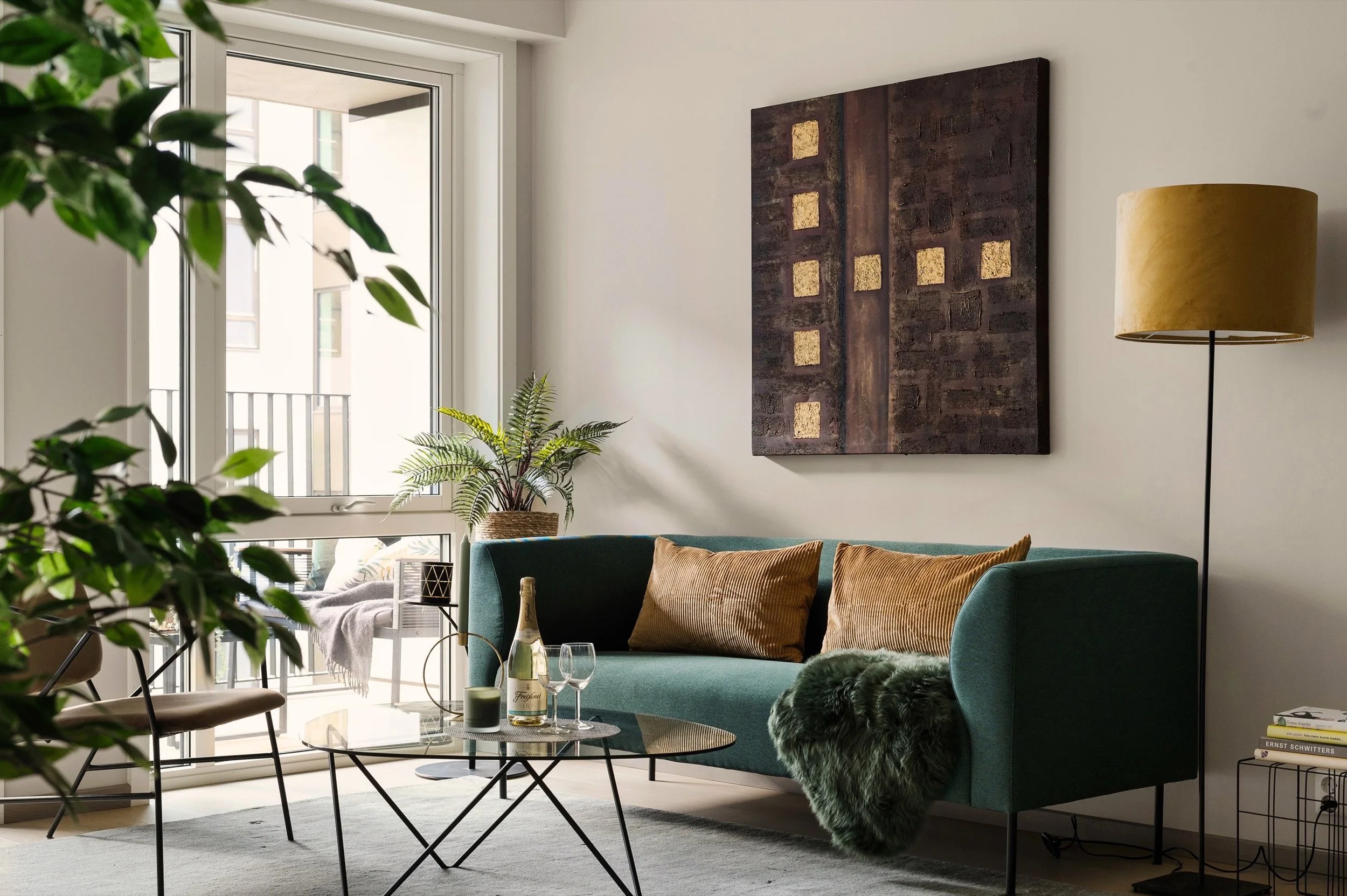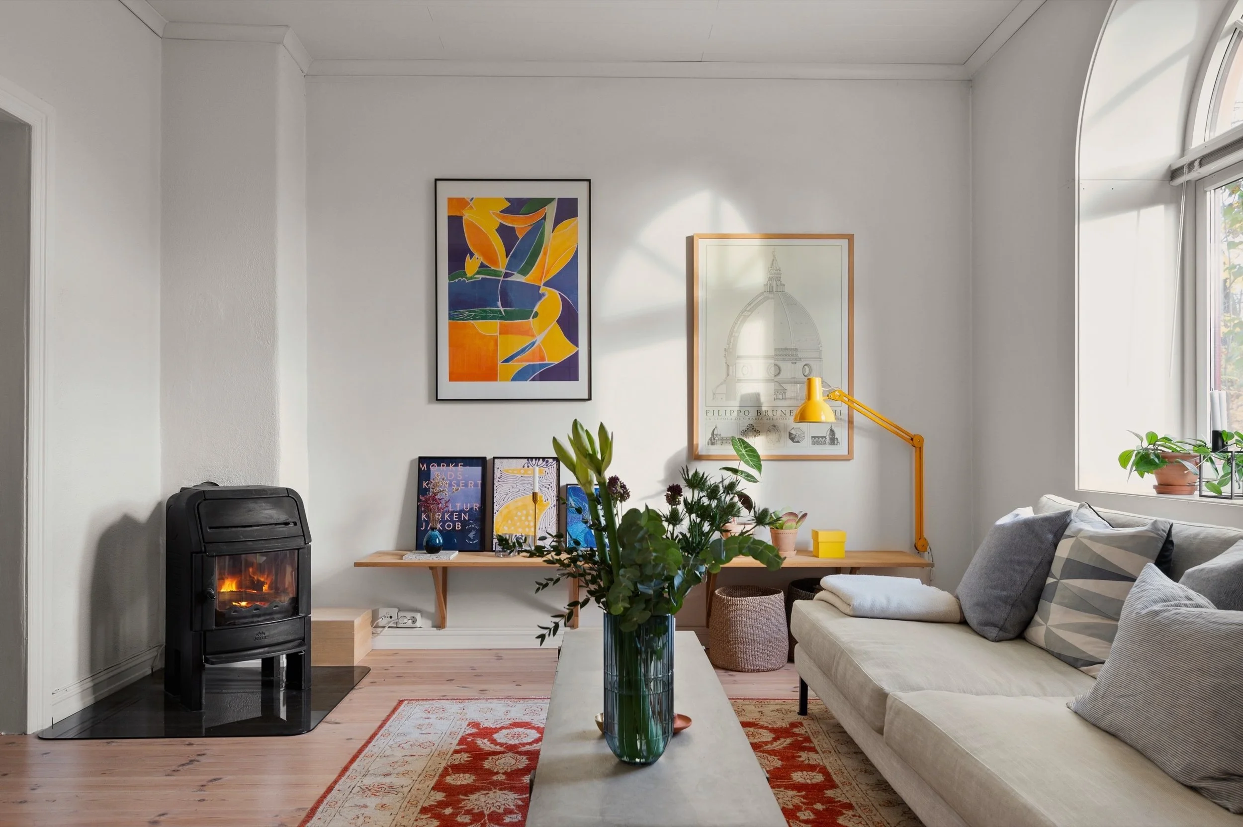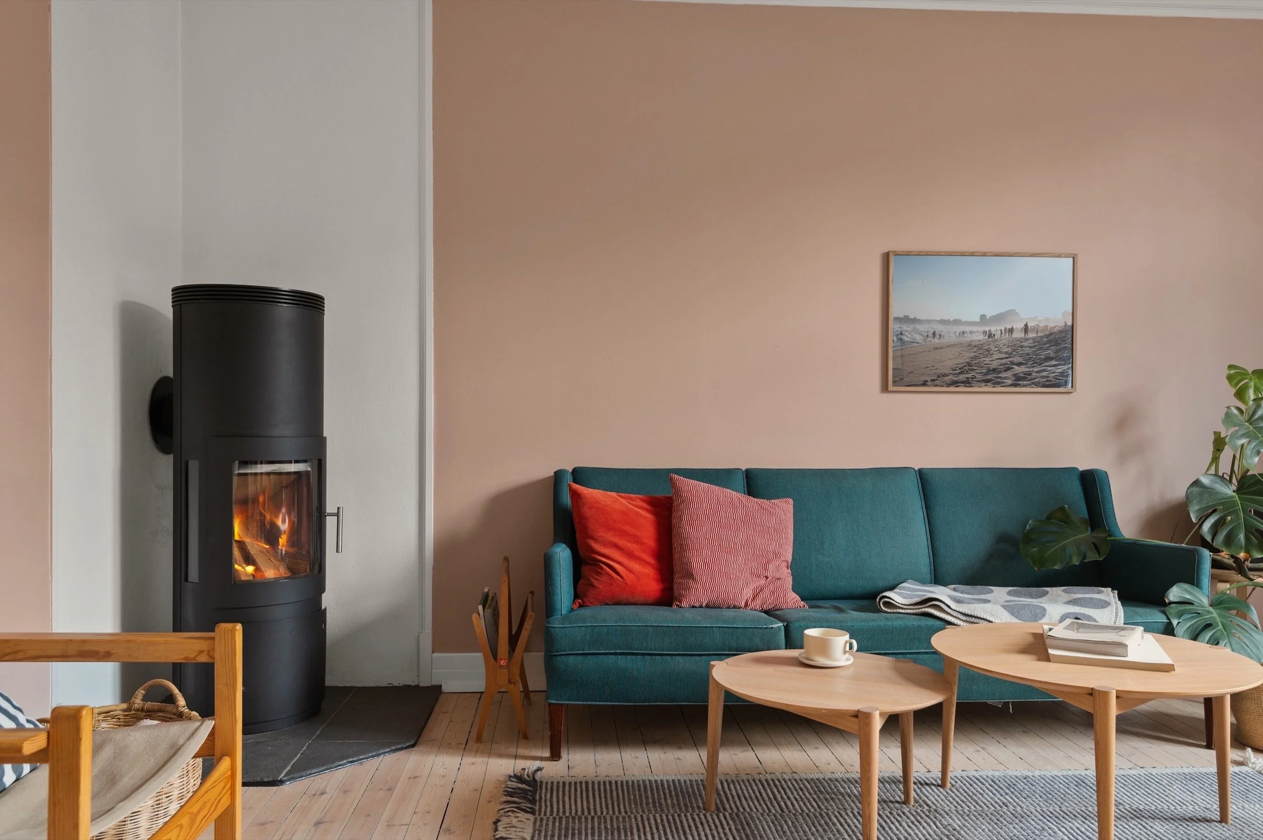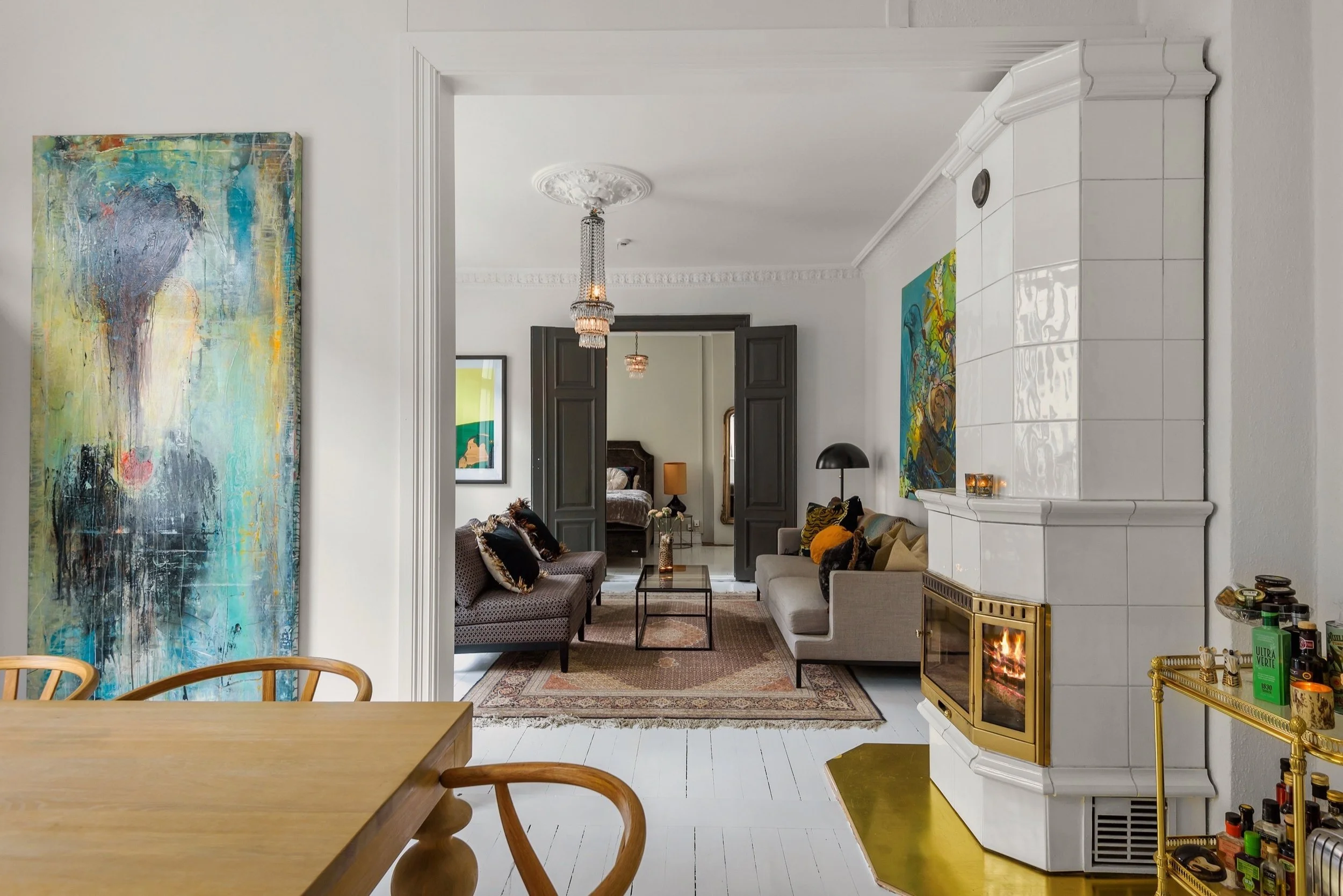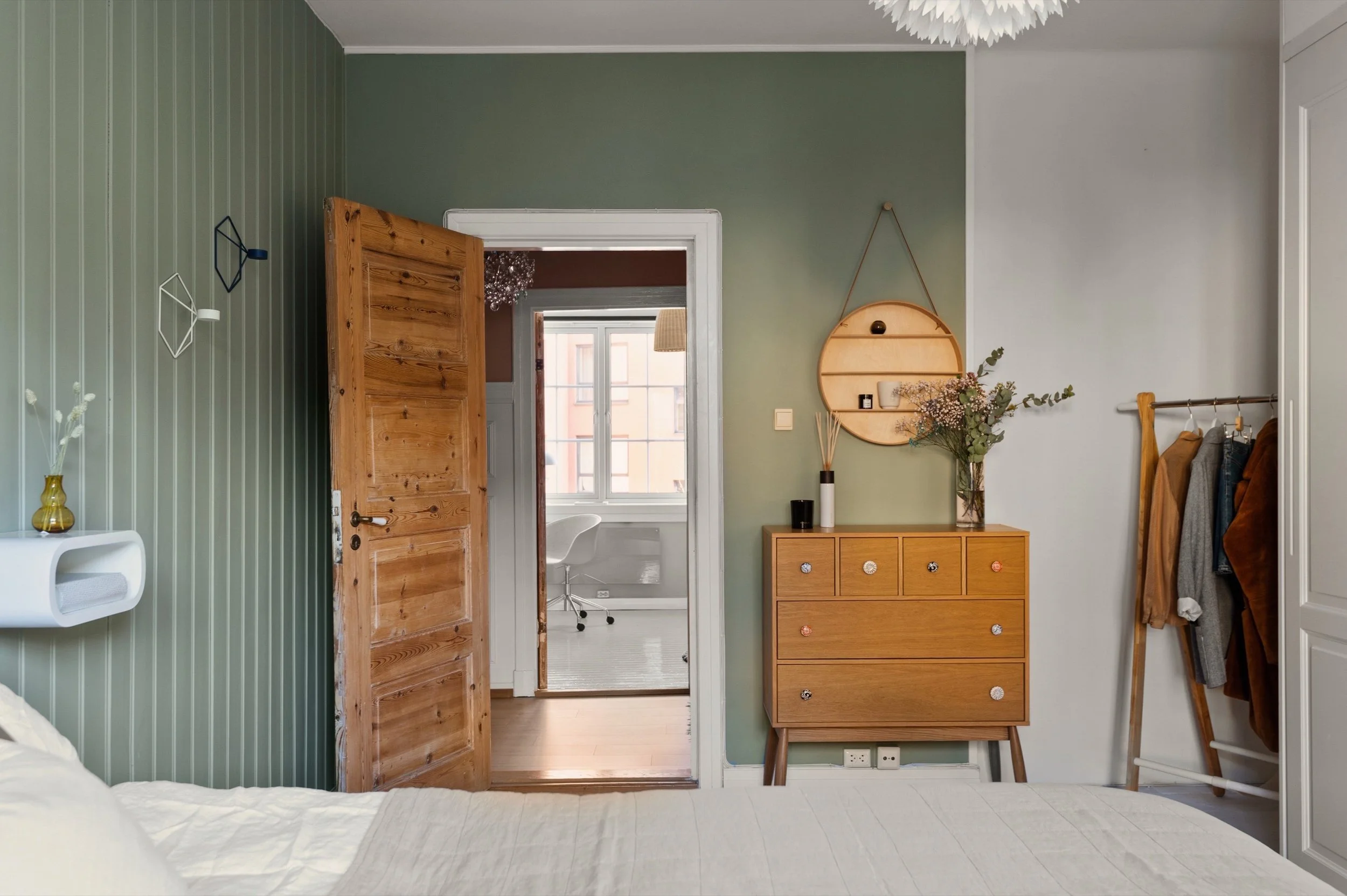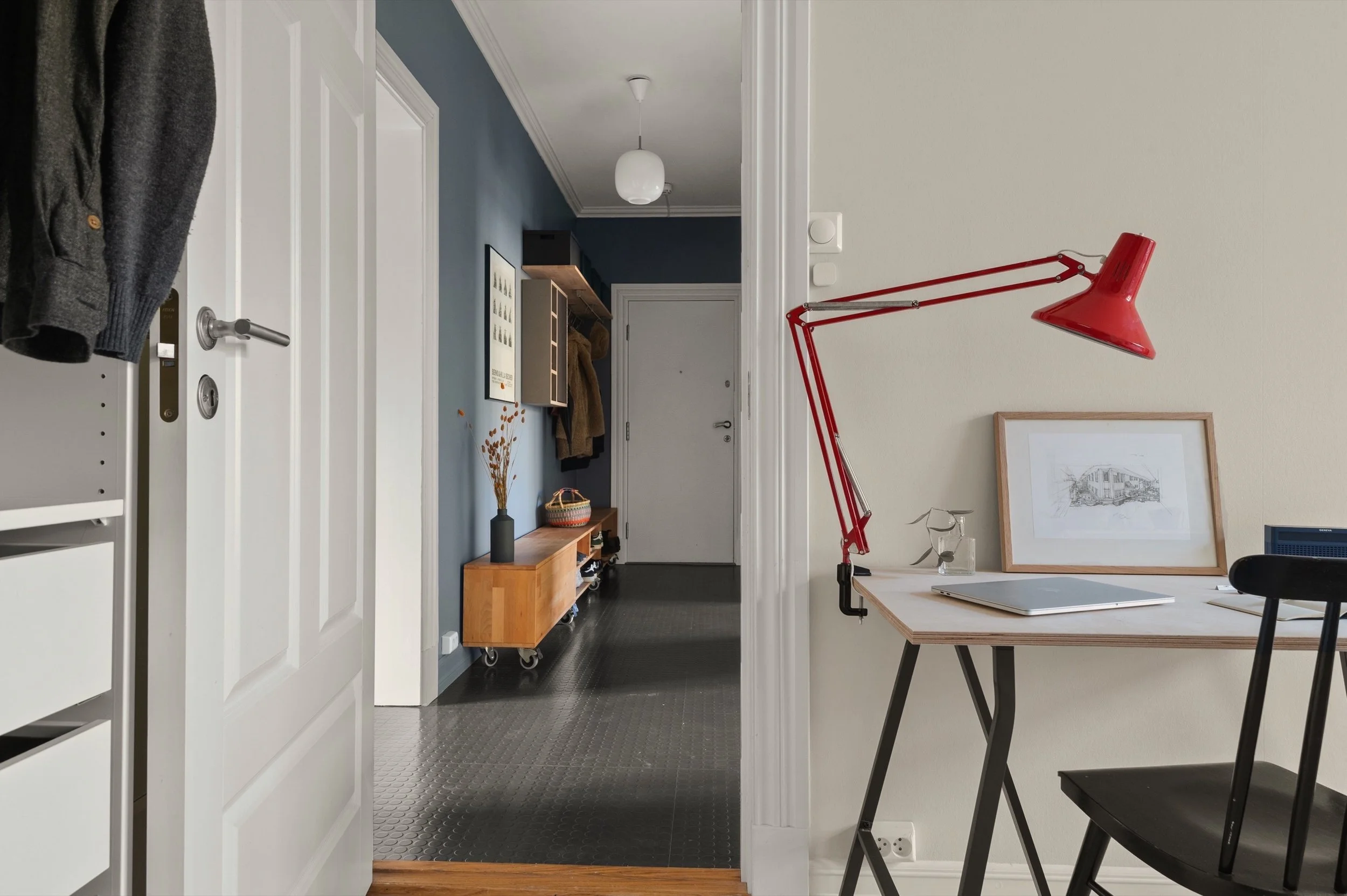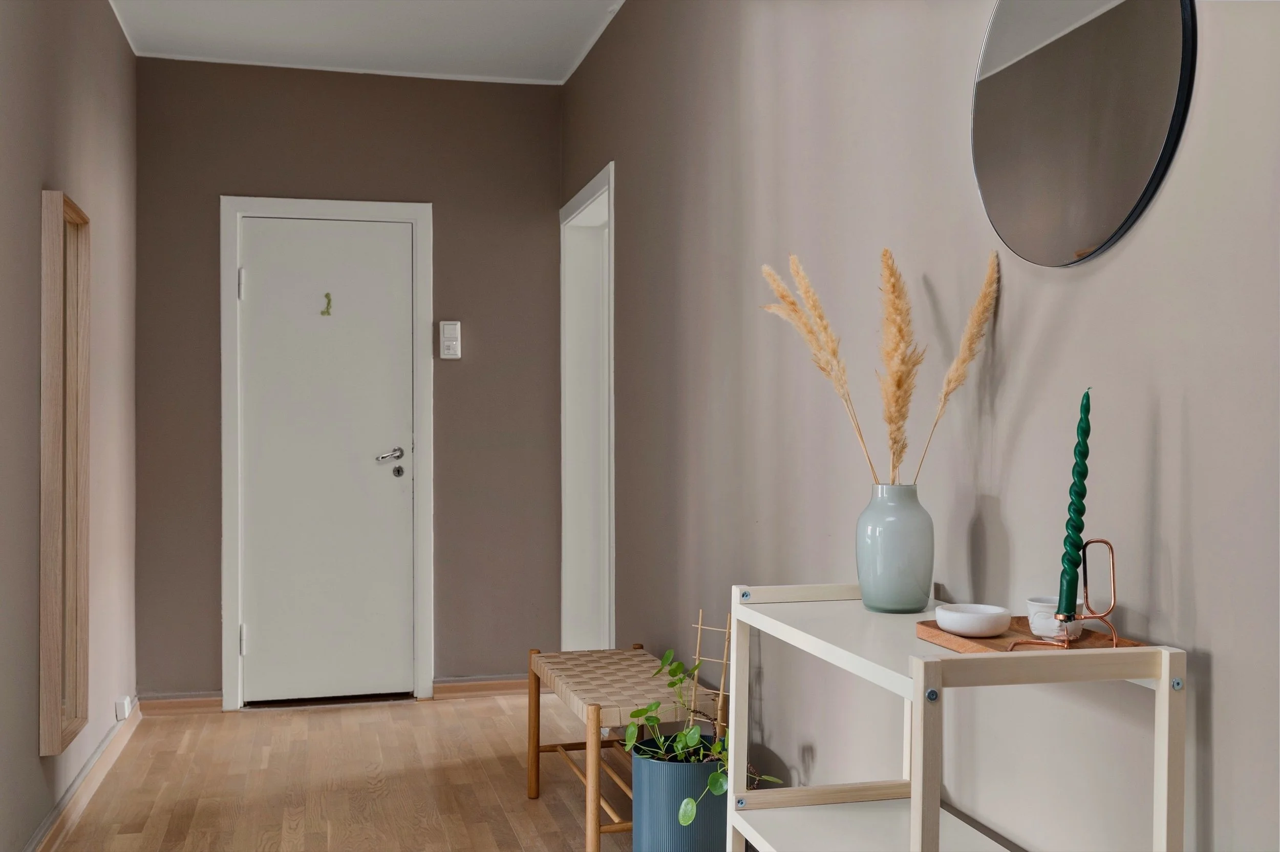
Editing/Magazine
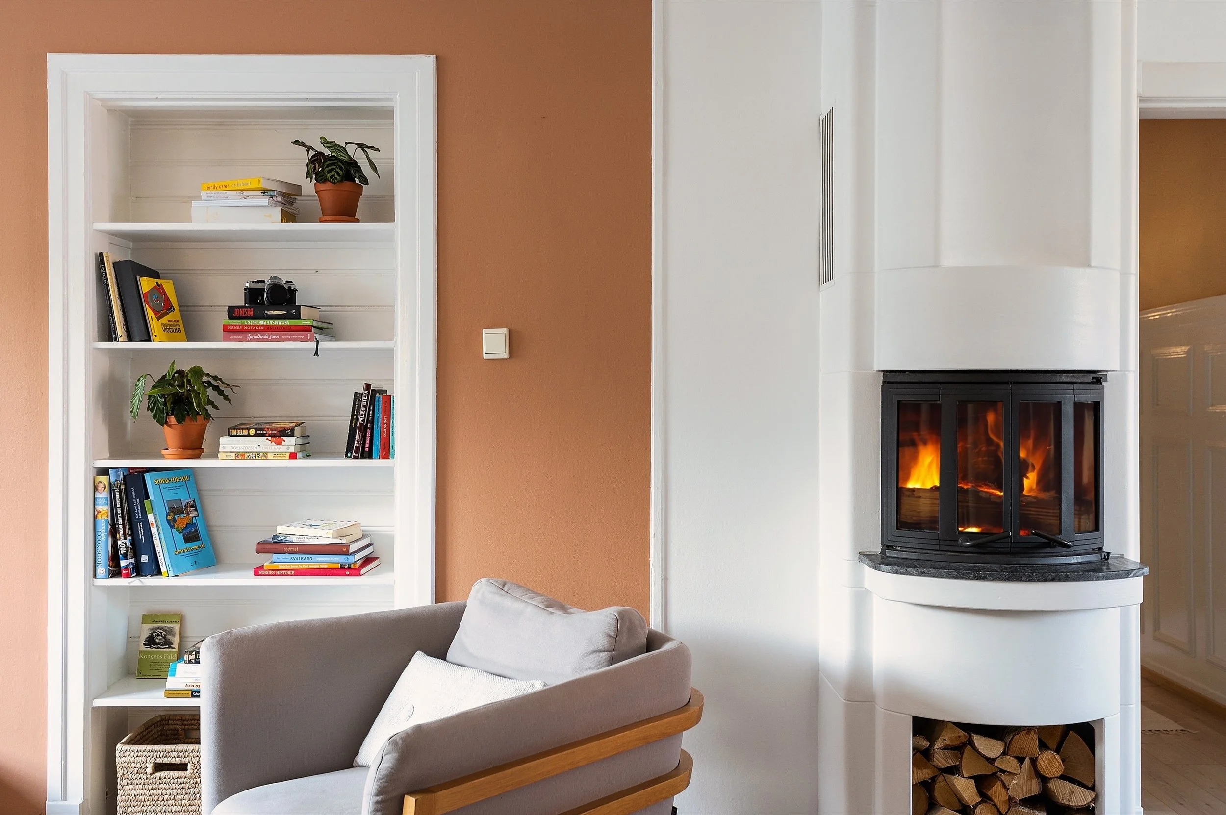
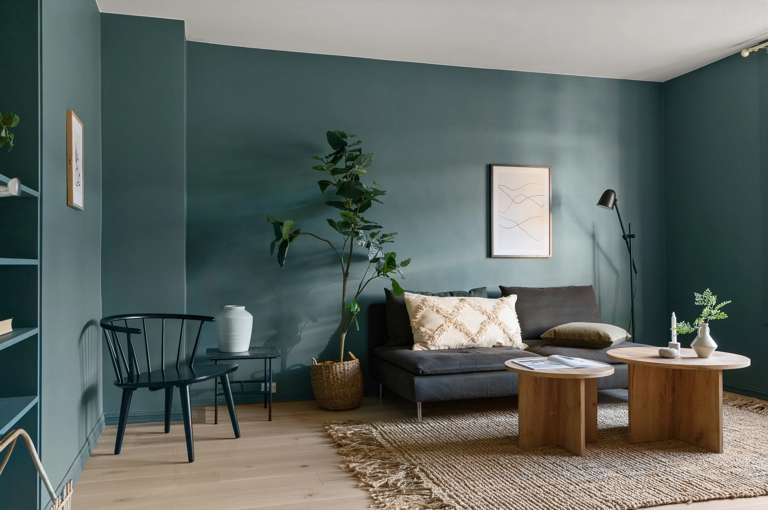
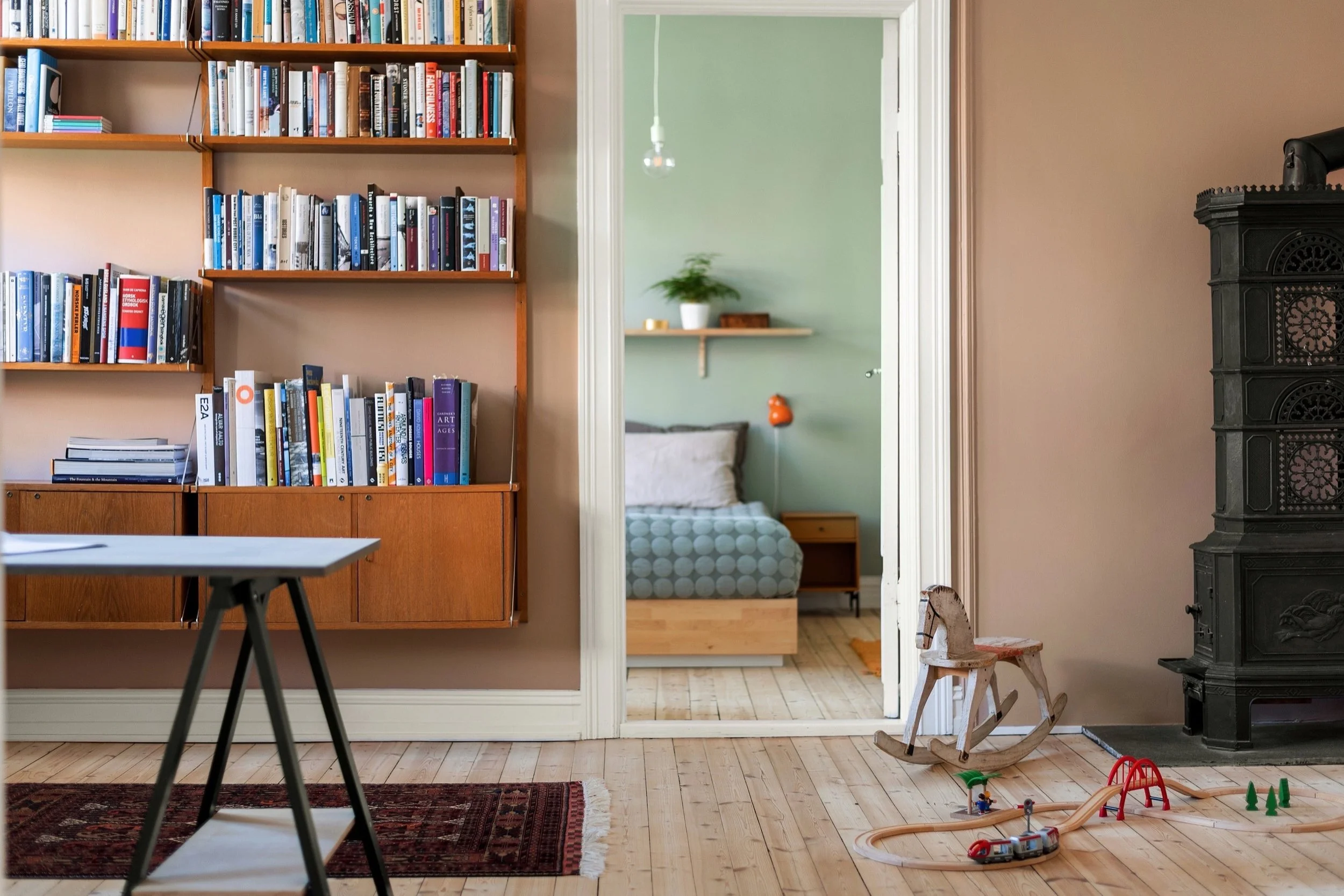
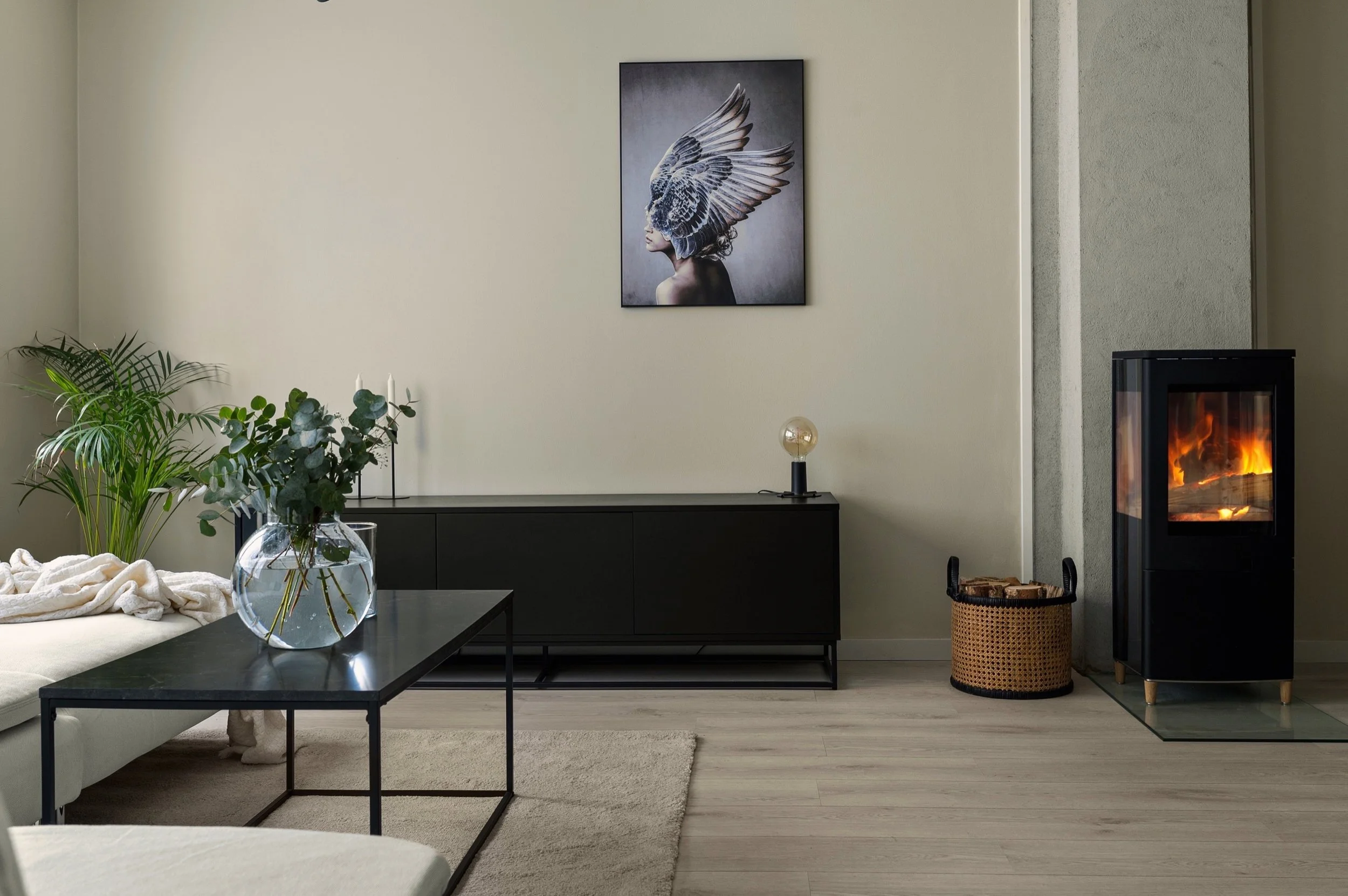
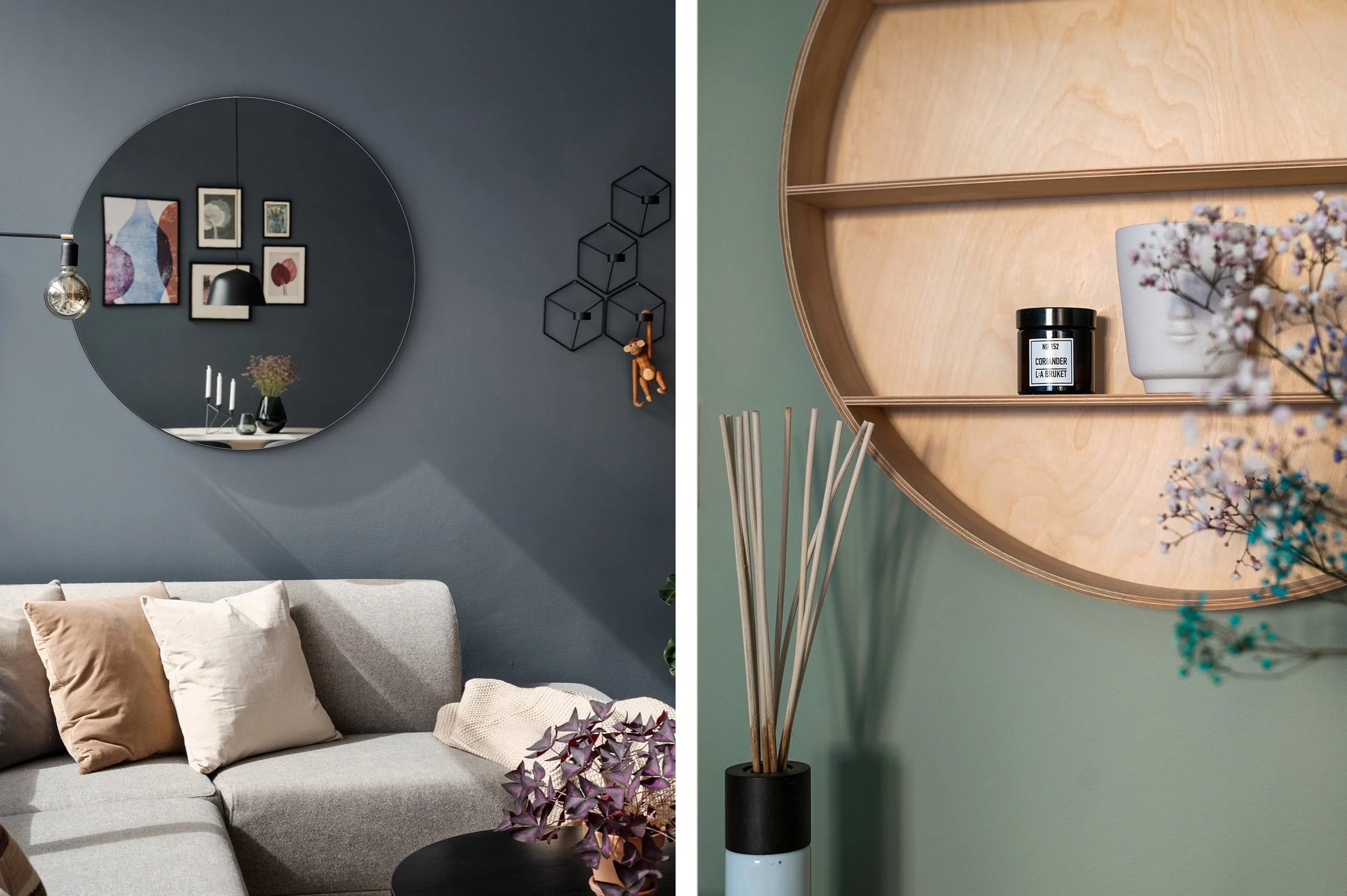
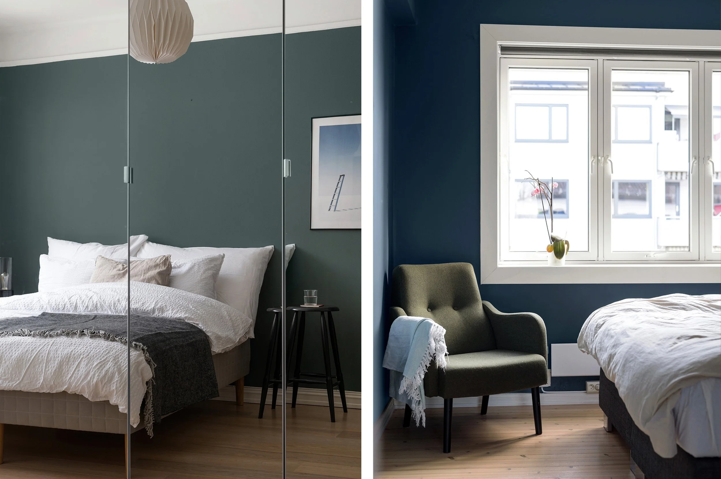
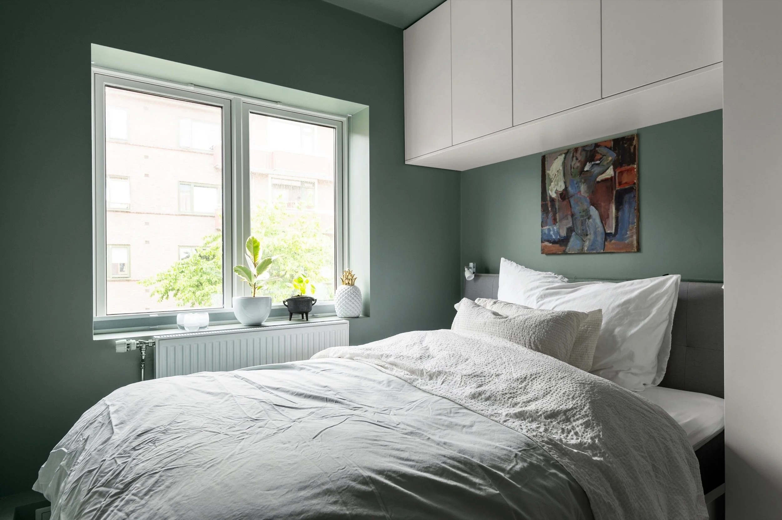
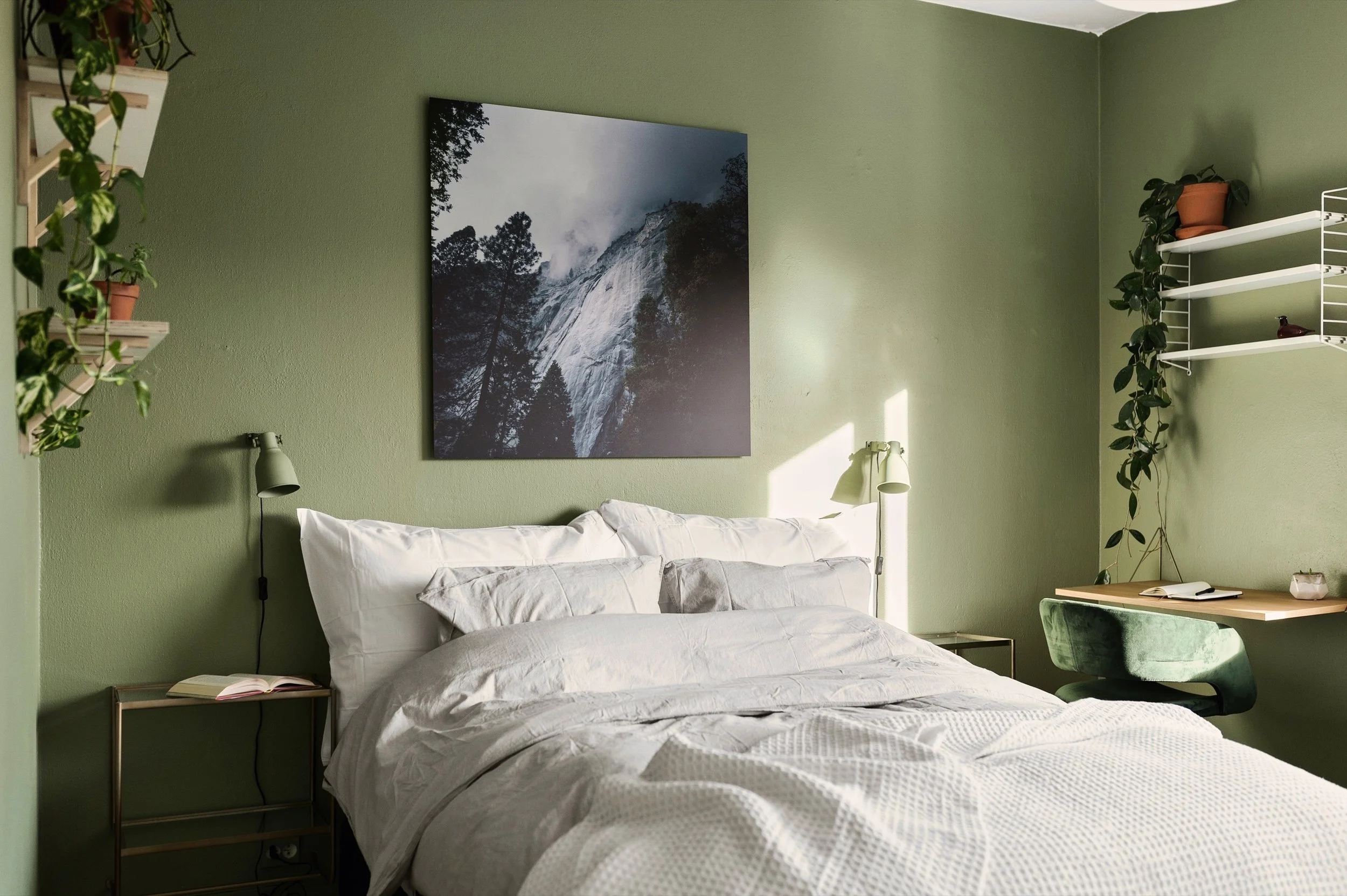
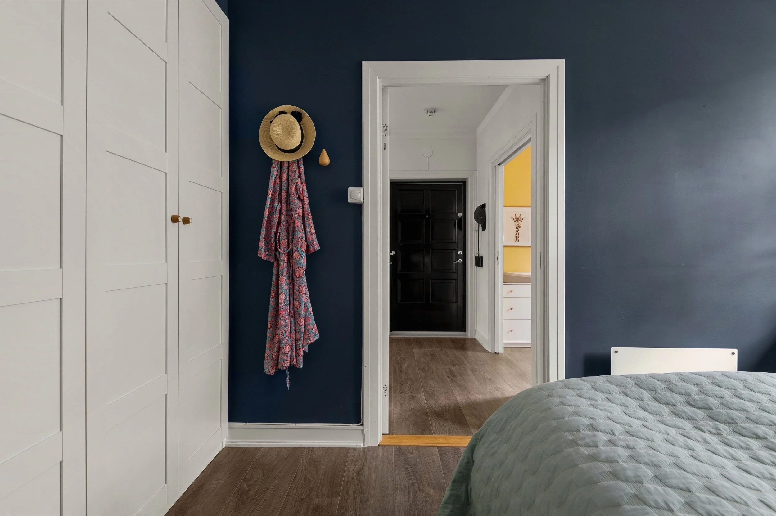
Normally, all lamps are turned off in images where I order «magazine» style editing, and I use mostly daylight, maybe with some added flash.
This editing style should have good contrast, and good saturation and «pop». Colors should be quite neutral. Keep shadows quite dark, same as in the images below. Make sure that the images retain an ambient look, and that there is a nice play of light and shadows.
In brighter areas, keep some of the brightness. If it’s burnt out etc. you can add some texture from darker exposures. But in general, adding too much in bright areas “flattens” the light play too much, and takes away some of the nice contrast…
Normally the windows should be quite bright, but I will mention my window brightness preferences every time I send in a new order. See below for image examples of this style.